
At the moment of the April 28 blackout that left tens of millions without power in Spain and Portugal, solar and wind sources represented more than 60% of the power fed into the region's electrical grid. Image: Screenshot, Diario Sur
Blackout in Spain and Portugal, Canada and Australia Elections, and a New Pope Elected

Gathering Evidence and Documents in Conflict and War Zones — A MENA Case Study

Tipsheet: How Journalists Can Use a UN Process to Evaluate National Human Rights Records

Investigating US Government — and Trump Administration — Influence in Your Country

Academic and Training Scholarships for Investigative Journalism
Habemus Papam! It took just three ballots for Cardinal Robert Prevost, a US citizen by birth, to be elected the newest leader of the Catholic Church. There will no doubt be plenty of data journalism related to Pope Leo XIV in the coming weeks, but with curation for this edition of our data column ending just one day after the white smoke rose from the Sistine Chapel, we found plenty of data on the conclave — the assembly of cardinals that elects a new pope — including a detailed guide from the Atlo Team on the voting process. This edition of our Top 10 in Data Journalism, which considered stories between April 26 and May 9, also highlights the numbers from the first 100 days of the second Trump administration; the investigation into the death of a Ukrainian journalist in a Russian prison; and an analysis of India and Pakistan’s nuclear arsenals.
Electing a New Pope

Image: Screenshot, Atlo
On May 8, Cardinal Robert Francis Prevost was elected pope — adopting the name Leo XIV — marking the first time a US citizen by birth was chosen as pontiff. But before the 267th leader of the Catholic Church was elected, expectations for the conclave were sky-high, even drawing high-stakes bets. The Átlátszó data team produced a beautifully illustrated special, including a detailed guide to the rites involved in the conclave, which had the largest number of voting cardinals in history. It included a series of maps showing the location of papal tombs in Rome and in Europe that still exist today, and a 3D model of some Vatican buildings and the Sistine Chapel, where the conclave has been held since 1878. It also presented graphs such as the diverse origins of the electors, the balloting and voting process, and positions of the main papal candidates on key issues, such as the blessing of same-sex couples and communion for the divorced.
100 Days of Trump

Image: Screenshot, the Guardian
US President Donald Trump recently completed 100 days of his new term in office. According to the Guardian, the first months of Trump’s second term have been marked by the constant presence of outliers — a term used in statistics and data journalism to designate a data point that differs significantly from other observations. To demonstrate this point, the Guardian showed a series of graphs — including the sharp drop in markets after the announcement of tariffs on imports from other countries; the vertiginous increase in the price of eggs; the number of arrests made by ICE; how most of the pardons granted by the president were for January 6 insurrectionists; a record use of executive orders and actions — much higher when compared to previous presidents; and how Trump’s approval rating has quickly turned from positive to negative.
US Homes Without Chinese Products

Image: Screenshot, The New York Times
President Trump’s tariff wars continue to generate headlines and data journalism. One of the main victims is China, which responded to Trump’s rhetoric and orders by announcing increasingly higher reciprocal tariffs before agreeing to a recent 90-day pause in the escalation. But how much does the United States depend on Chinese products day-to-day? The answer is: a lot. Many household items in the US come almost entirely from China, making a world in which Americans have to buy everything domestically unlikely. The New York Times reflects on this topic through an interactive that used the floor plan of a typical American home to show the reader what percentage of US imports come from China. Among the items with the highest percentage of Chinese production — which appear in red — are toasters (99%) and baby strollers (97%), while wooden cabinets (4%) and mattresses (2%) have the lowest share.
Also check out this Financial Times special report — a visual guide to why it’s “highly impractical” to manufacture iPhones in the US, as the Trump administration wishes.
Tracing a Ukrainian Journalist’s Last Days

Image: Screenshot, The Washington Post
According to The Washington Post, “the treatment of detained Ukrainian civilians is one of the most brutal and least examined parts of the Kremlin’s prosecution of the war.” In this report, the newspaper recounted how Ukrainian journalist Viktoriia Roshchyna wanted to expose this hidden penal system and was then detained and secretly held in a Russian prison for months until Russian Defense Ministry officials announced her death in September 2024. A coalition of 45 journalists from 13 international outlets, led by Forbidden Stories, followed Roshchyna’s work and conducted a months-long investigation into her detention and death, as well as the Taganrog complex where she was allegedly detained. The Post featured a mapping of 29 locations in occupied Ukraine and Russia identified by reporters where Ukrainian prisoners said they were subjected to torture and abuse, and a 3D reconstruction of SIZO-2 in Taganrog, in southern Russia — a key facility in a constellation of Russian prisons and makeshift detention centers where Roshchyna spent most of her time in custody.
Spain and Portugal in the Dark

Image: Screenshot, Diario Sur
On April 28, a total collapse of the electrical system left the Iberian Peninsula in darkness. According to the Spanish newspaper Diario Sur, the concept of a blackout was little known until that day, but since then, it has appeared in headlines, conversations, and official explanations. To explain the incident to its readers, including the possible reasons behind it, the newspaper created an interactive explanation comparing the electrical grid to a system of interconnected hydraulic pipes, explaining how Spain’s electrical system works — and how it failed. The report then presented a sequence of graphs, such as the evolution of electricity demand in the peninsula on the day of the incident and an interactive of energy generation in the peninsula every five minutes, by energy type, as well as maps of Spain’s power generating plants — by type, and of the country’s new underground interconnection with France, through the Bay of Biscay.
Canadian Election Overview

Image: Screenshot, Toronto Star
Trump’s tariff war has strained relations with its historic ally, Canada. He has also, on several occasions, threatened to annex the country. As a result, expectations — and stakes — for the Canadian federal election held on April 28 were high. The Toronto Star produced a special on the election, which Mark Carney and former prime minister Justin Trudeau’s Liberal Party won handily. But although the Liberals remained in government and, like the Conservatives, increased their seat count and vote share compared to the 2021 election, they did not win a parliamentary majority. The report featured an interactive map where you can check the results in real time and perform searches, a series of electoral graphs such as the number of seats won by each party and the history of electoral participation, and analyses from the morning after Canada’s 45th federal election.
Labor Wins Big in Australian Elections

Image: Screenshot, ABC
Australia also just conducted a nationwide election, five days after Canada’s vote. And the results followed a similar theme. The more liberal Labor Party won a surprisingly strong majority, casting out the more conservative Coalition in numerous suburban seats, despite the latter making a point of targeting middle-class voters in these “forgotten” areas. The Australian Broadcasting Corporation’s deep data dive looked into the broad shifts to Labor in the electorate across almost every state and territory and then drilled down to look at the impact in specific seats. This included a post-mortem analysis of the seat of Liberal Party and Coalition leader Peter Dutton, who was upset in his home district of Dickson in Queensland, losing the parliamentary seat he had held since 2001.
India and Pakistan’s Nuclear Arsenals

Image: Screenshot, Al Jazeera
India’s missile strike on Pakistan in the early hours of May 7, followed by four days of intense combat with fighter jets, missiles, and explosive-laden drones, raised fears of another war — but a ceasefire was signed on May 10. This was just the latest episode in a long-running conflict with roots that go back more than seven decades, when India and Pakistan were still part of the same territory under British rule. Upon gaining independence from Britain, the territory was divided into two parts with different religions — a process that left millions dead and displaced, and other consequences that still shape life today. Since the 1947 partition, India and Pakistan have been fighting over control of the province of Kashmir. The problem now is that, unlike 70 years ago, both are nuclear powers. In this report, Al Jazeera showed how India and Pakistan are big military spenders and analyzed the nuclear and conventional military capabilities of both countries — providing a series of graphs that show the countries’ spending, estimates of their troops, military vehicles, and nuclear warheads, as well as types of military aircraft and who supplies arms to both countries.=
Berlin After World War II
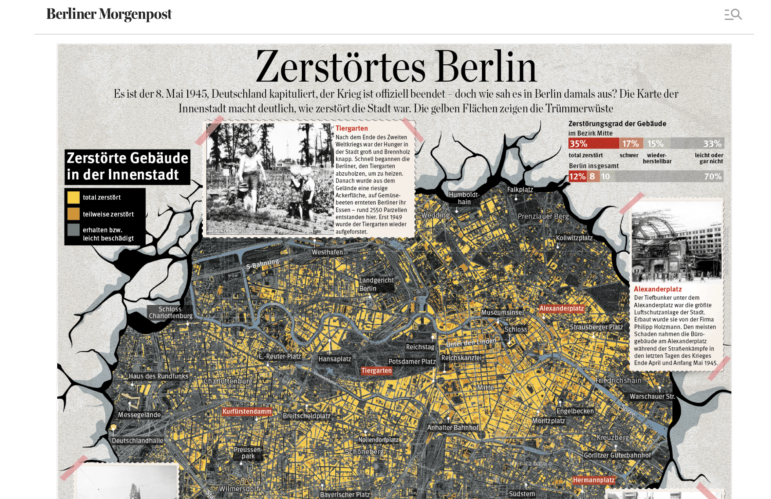
Image: Screenshot, Berliner Morgenpost
Marking 80 years since the end of World War II, the print edition of the German daily Berliner Morgenpost offered some interesting maps of the destroyed buildings in the center of Berlin, showing the city’s devastation after the surrender on May 8, 1945. The report provided data on the devastation and highlighted certain points of the city. Among them, the Zoological Garden, which, according to the report, ended up stripped of trees due to a shortage of firewood, and the city’s famous Alexanderplatz, where the city’s largest underground bunker and air raid shelter were located and where the surrounding buildings suffered the greatest damage. The report also detailed the stages of removal of the war debris scattered across the streets and properties and reconstruction of the city, graphs on the amount of rubble in Berlin and the population exodus, and a timeline of events in the post-war months.
Wildlife Trafficking Fuels Terrorism

Image: Screenshot, HumAngle
Terrorist financing in Nigeria is diverse. This is according to the HumAngle, which investigated the wildlife trade in northeastern Nigeria and how it funds the terrorist organization Boko Haram. According to the report, poachers and terrorist groups — operating in the Molai wilderness, a forest area known to be unregulated — have switched from hunting elephants to hunting warthogs for their equally valuable tusks. HumAngle explained, by mapping elephants’ recent migration corridors, that the species has been moving out of the area and more into Cameroon thanks to constant conflict and loss of forest density. The same mapping showed that warthogs have a much smaller migratory movement, which means they are less able to escape targeted hunting. Furthermore, unlike elephant ivory, which is subject to intense scrutiny and regulation, warthog tusks exist in a legal gray area, which has been eagerly exploited by traffickers.
 Ana Beatriz Assam is GIJN’s Portuguese editor and a Brazilian journalist. She has worked as a freelance reporter for the newspaper O Estado de São Paulo, mainly covering stories featuring data journalism. She has also worked for the Brazilian Association of Investigative Journalism (Abraji) as an assistant coordinator of journalism courses.
Gathering Evidence and Documents in Conflict and War Zones — A MENA Case Study
Tipsheet: How Journalists Can Use a UN Process to Evaluate National Human Rights Records
Investigating US Government — and Trump Administration — Influence in Your Country
Academic and Training Scholarships for Investigative Journalism

Announcing the Sigma Awards 2025 Shortlist
Electing a New Pope, North Korea Fighting Ukraine, Vaccination Rates to Stop Outbreaks, and a Deadly Gold Mine in Turkey
Rolling Trade Wars, Earthquake in Myanmar, Oil in the Amazon, and Politics of Time Zones

COVID-19’s Impact Five Years On, Chinese Harassment of Taiwan, Peruvian Political Fortunes, and 75 Years of Formula 1

This work is licensed under a Creative Commons Attribution-NoDerivatives 4.0 International License
Republish our articles for free, online or in print, under a Creative Commons license.
Republish this article
This work is licensed under a Creative Commons Attribution-NoDerivatives 4.0 International License
Read Next
Awards, Grants, & Fellowships Data Journalism
Announcing the Sigma Awards 2025 Shortlist
GIJN, the new home of the Sigma Awards, is proud to announce the 2025 shortlist for the best data journalism projects and portfolios in the past year.
Data Journalism Top 10
Electing a New Pope, North Korea Fighting Ukraine, Vaccination Rates to Stop Outbreaks, and a Deadly Gold Mine in Turkey
Also highlights how X influences Elon Musk’s government policy, the numbers behind the successful Danish toy maker Lego, and mapping the Sudan conflict.
Data Journalism Top 10
Rolling Trade Wars, Earthquake in Myanmar, Oil in the Amazon, and Politics of Time Zones
Also highlighting data investigations into oil exploration in the Amazon, women who travel for an abortion in Europe, and and how music is passed down through generations.
Data Journalism Top 10
COVID-19’s Impact Five Years On, Chinese Harassment of Taiwan, Peruvian Political Fortunes, and 75 Years of Formula 1
Also this week, a visual narrative on the 30th anniversary of the Tokyo subway sarin gas attack, a special feature on Ramadan, and the grim statistics of death prediction.